You have met Chad Brown a member of our team from Polar Grid.
 Data backup man!!!
{photo of Chad 1 of 6]
He along with Keith Lehigh represent Polar Grid and brought to the field the computer processors which enable the team to get a first look at the data to ensure that all the equipment is in perfect working order. Keith was here the first part of the expedition and left last week. Not one for smiling in front of a camera I did get a grin from him just before he boarded the plan out of Byrd Surface Camp.
 Last day for Keith at Byrd Surface Camp
Logan Smith, a member of the team from KU, does some of the early processing.
 Graduate research assistant for CReSIS
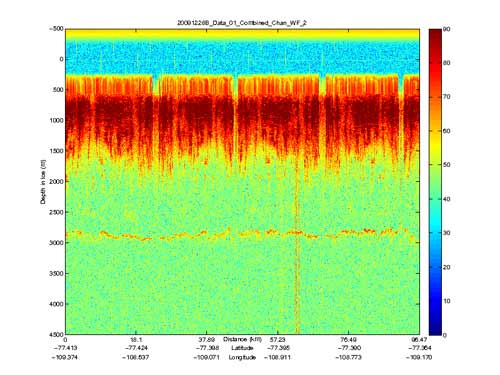
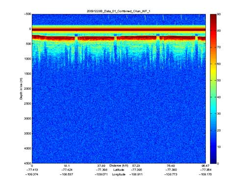
Here is a picture of the data you helped collect on our flight yesterday.
 Graph #2
 Graph #1
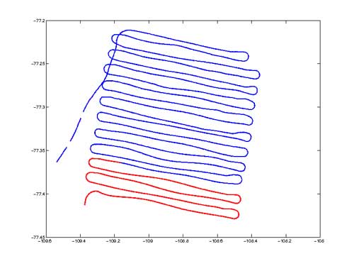
Study the graphs of the data. The x-axis has the points of latitude and longitude which also correspond to the same points on your flight plan.
 A CReSIS flight plan used by the pilots
The y-axis on the data graph shows the depth in meters as recorded by the radar.
On the y-axis you will see that zero is not on the bottom of the axis like most of the graphs you might work with in school. Zero is up near the top and it represents the point inside the plane from where the radar sends its signal. You will also see a color change at about 250 meters. This is surface of the ice sheet.
The Challenge:
Look at your flight plan and the data picture. Mark on you flight plan where this data set was taken during the flight. (Hint: Use the points of latitude and longitude.)You will discover that this is not the data from the whole flight.
Why are there gaps in the orange data at regular intervals? (Hint: What is the plane doing at those points of latitude and longitude?) You have now been looking at this data set. Notice the distinct line at around 3000 meters. That is the ground under the ice sheet. You will also see on the x-axis how many kilometers this data set represents.
Now that you have marked your flight plan to represent the data set you have studied. Approximately how many kilometers did we fly for the whole day's mission?
Can you think of ways this data could be used?
What could be studied if we could know what the topography is beneath the ice sheet?
Answers:
The data chart represents the red lines on the flight plan (plus a little more).
The gaps in the orange colored layers represent the times the plane leaves the grid and turns. As it turns it banks to the left or right and the wings are not parallel to the ground and the radar is not focused down into the ice.
The flight plan represents 500-600 nautical miles.
4&5 I will let you be the scientists and post your ideas to "Ask the Team"
Great Job, Trekkers Mr. W
***Note from PolarTREC Team: Join us for the last live event with Gary and the Team on Thursday, 7 January 2010. For more information about the times and to register, please check out the Live from IPY pages or click here. ***

