What a spectacular day, the sun was shining all day today! It never ceases to amaze me how much of a difference a little sunshine can make! Things warmed up today. It was only 3 °F, but it felt like a balmy day! We got the compressor running again - after sticking it into the tent for a couple hours with a kerosene heater on it!
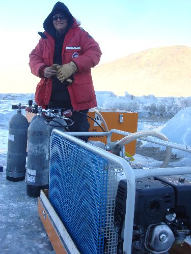 321mecompressor.JPG
We got the compressor running again; more air is on the way!
Aslan dove to release the control on Hal that allows him to move laterally. We do not yet want that to happen automatically, so Aslan went down to do it by hand! Thanks to his terrific communication skills, we knew just what he was doing and were able to position Hal into the proper position for that next data run.
Communication is key! Listen to the audio file I have attached (see bottom of this journal entry) which has Ian talking to the three of us on the service. Notice how carefully you have to listen in order to understand what is being said!
For those of you that tried to determine what the data is showing in the picture from yesterday (posted again here) - what did you come up with?
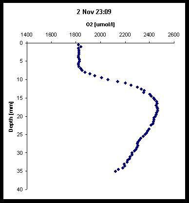 314xygen_profile
Just a reminder of yesterday's data challenge!
Answer:
The axis on the left is showing the distance the probe actually moves, in millimeters. When the distance reads "0", the probe is about 8 mm above the algal mat. As the distance increases in number, the probe actually enters into the algal mat and continues downward. From the "x" axis, you can see how much oxygen is being detected. So, at "0", there is about 1800 micro-moles/l. The straight line going down in the data set corresponds to measurements that were taken in the water column above the algal mat. If you look closely, starting at about 8mm, the data points start to "kink" - this is where diffusion is occurring. At about 10 mm, there are 3 data points that make a diagonal line off to the right. This indicates the point where the probe actually penetrates the algal mat. The increase in oxygen curve indicates the depth at which photosynthesis is occurring and there is oxygen production. The decreasing curve back to the left indicates the depth where less oxygen production is occurring. Pretty cool huh?
Parting pictures for today:
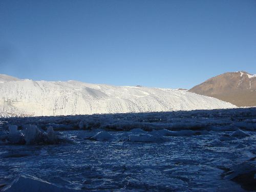 322canadaglacier.JPG
The Canada glacier basks in the sun!
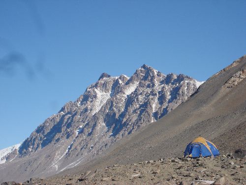 323homesweethome.JPG
Home sweet home
You can also check out my journals and pictures from previous seasons at: http://www.ryejrhigh.org/ellwood
